Ambetter Member Communication
Ambetter Member Communication
Now, this project is a little different in that there are no answers; there are only solutions.
Concept
Effective member communication requires more than sending messages—it means designing interactions around how members prefer to engage. They’re not just users but people actively managing their health. The goal is to create a system that balances static essentials, dynamic updates like claims and payments, and evolving business needs.
Opportunity
For members to take meaningful action, Ambetter communications must feel valuable, clear, and personally relevant. Today, messages are delivered from multiple sources with little coordination—lacking structure, prioritization, and the emotional cues that inspire engagement.
Solution
Our solution needed to feel intentional and personal—sharing the right information at the right moment, avoiding overload or confusion, and ideally adapting to each member’s individual behavior and context.
Goals
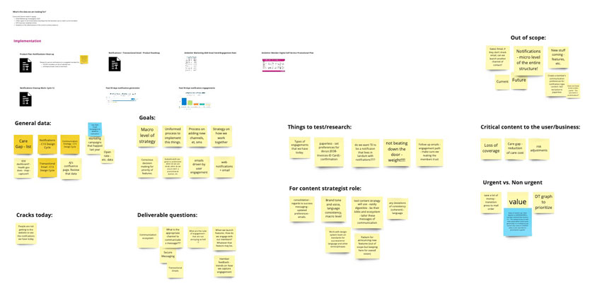
- Put together identity profiles and identify contact motives to see the two-way street in communication
- Collect today’s patterns, categorize by function, define the component, identify the sources, and capture their purpose
- Gather Market research
- Use existing testing and research data on member communication
- Map channel interaction to see the whole picture between outreach emails, through notifications, and through completion
Actions
- Understand what the current communication structure looks like and how it is used
- Take a look at the architecture of where different types of messages are being used in the existing experience
- Identify why this pattern contains the assigned content
- Collaborate with the Design System team, as they are who will ultimately own the member communication pattern creation
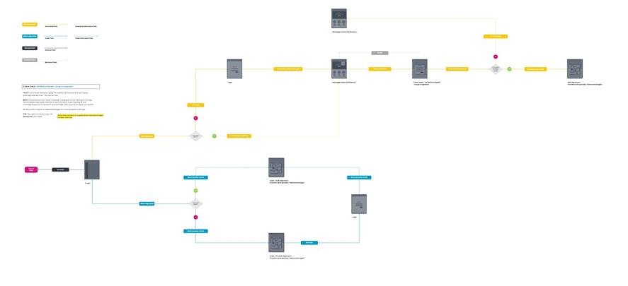
The Audit
Understand how existing communications are related to each other to develop an initial map of the points of contact. Visual audit of all design patterns that are currently being used in our products to communicate with members.
The Testing
Within our 6-week cycle, we ran 3 tests with 100 participants each. The tests analyzed today’s pattern as the control and prompted testers to react and compare to alternatives to identify which was easiest to understand, most logically organized, most likely to prompt action, and how relevant the content was to the user.
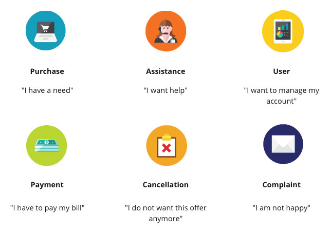
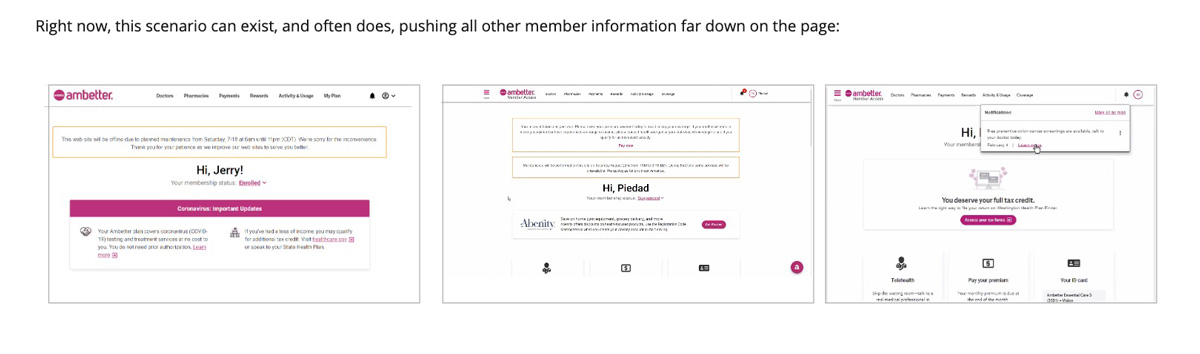
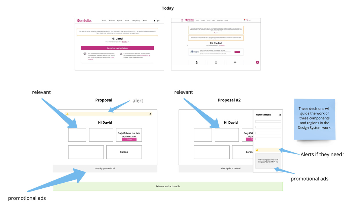
Today’s scenarios often pile content in banners on top of one another, which causes the member’s dashboard to fall below the fold. For some elements, it makes sense to take a portion of the screen in something relevant and pressing to the user like a Late Payment notification. However, in today’s structure, the banner for “Late Payment” and the banner for “Website Maintenance” banner are styled the same and stacked on top of each other.
These are very different pieces of information and require very different levels of attention from the user. A late payment could cause a member to lose coverage if not made in time, while the web maintenance requires zero interaction from the user and is simply a passive announcement. So our testing aimed to answer the question: Do these two different contact motives need different styling? While both need to be visible and accessible to the user, they do not have the same relevance to the user. We put together four different mocks to compare to today’s control and asked for reactions to each design, and then an explicit comparison between the five variants.
We tested content currently inside “Banners” with the content about Late Payments, Corona Information, and Web Maintenance alerts. All different contact motives. In each category, we received very interesting insights as to the preference and relevance of each content.
For example;
- 31% of members say it was important to see a website maintenance banner when first logging into the website, but that it did not need to be “front and center.”
- 51% said that if Autopay sign-up was displayed as part of the Late payment alert, they would sign up so they would not be late again
- 37% of members would come to the website looking for information about Coronavirus coverage, regardless of symptoms, and 62% of members would only come if they began having symptoms, or they would just assume they are covered and not come at all
The data from these tests helped us develop recommendations for a new hierarchy and design patterns for communicating with members. We will also use the findings to provide insights, support future design efforts, and define user needs as we continue our design system creation.
The Impact
The Member Communication System was created to transform how we connect with members—evolving from reactive, self-serve experiences to proactive communication that feels relevant, timely, and effortless. Grounded in a mindful design strategy, it considers what information members need, when and where they need it, and how it can best support their healthcare journey. This approach goes beyond traditional human-centered design by meeting members where they are in one of life’s most complex systems: healthcare.
The Guidelines
We should approach communication channel selection with an open mind, focusing on what will most effectively reach and engage our members. Rather than defaulting to familiar channels, we should evaluate each option to ensure it aligns with the project’s goals and audience needs. To guide our next communication effort, we can ask ourselves the following questions:
| What channels do our target audiences already use and trust? We need to think about their existing behavior. What sources of information do they already use/respond to? Do not invest in channels that our audience does not, or will not, use and trust.
| What is the purpose of our communication? Some channels lend themselves to communicating complex information; some are efficient ways of delivering short pieces of relevant information. The model below illustrates this on a spectrum.
Task
Lead Product Designer
-
Date
February 28, 2021
-
Skills
Sketch, Photoshop, Miro, Userzoom
-
Client
Centene