Swiftphone Buyer Journey
Swiftphone Buyer Journey
Enterprise buyer journeys are inherently complex—especially when they involve recurring fees, one-time installation costs, equipment rentals, and add-on services. This project focused on redesigning an enterprise purchasing and checkout portal to simplify that complexity and help users complete large, multi-step transactions with confidence.
The goal was to create a guided, transparent experience that could accommodate multiple buyer scenarios, from self-service purchases to multi-approver workflows involving managers or procurement teams.
OPPORTUNITY
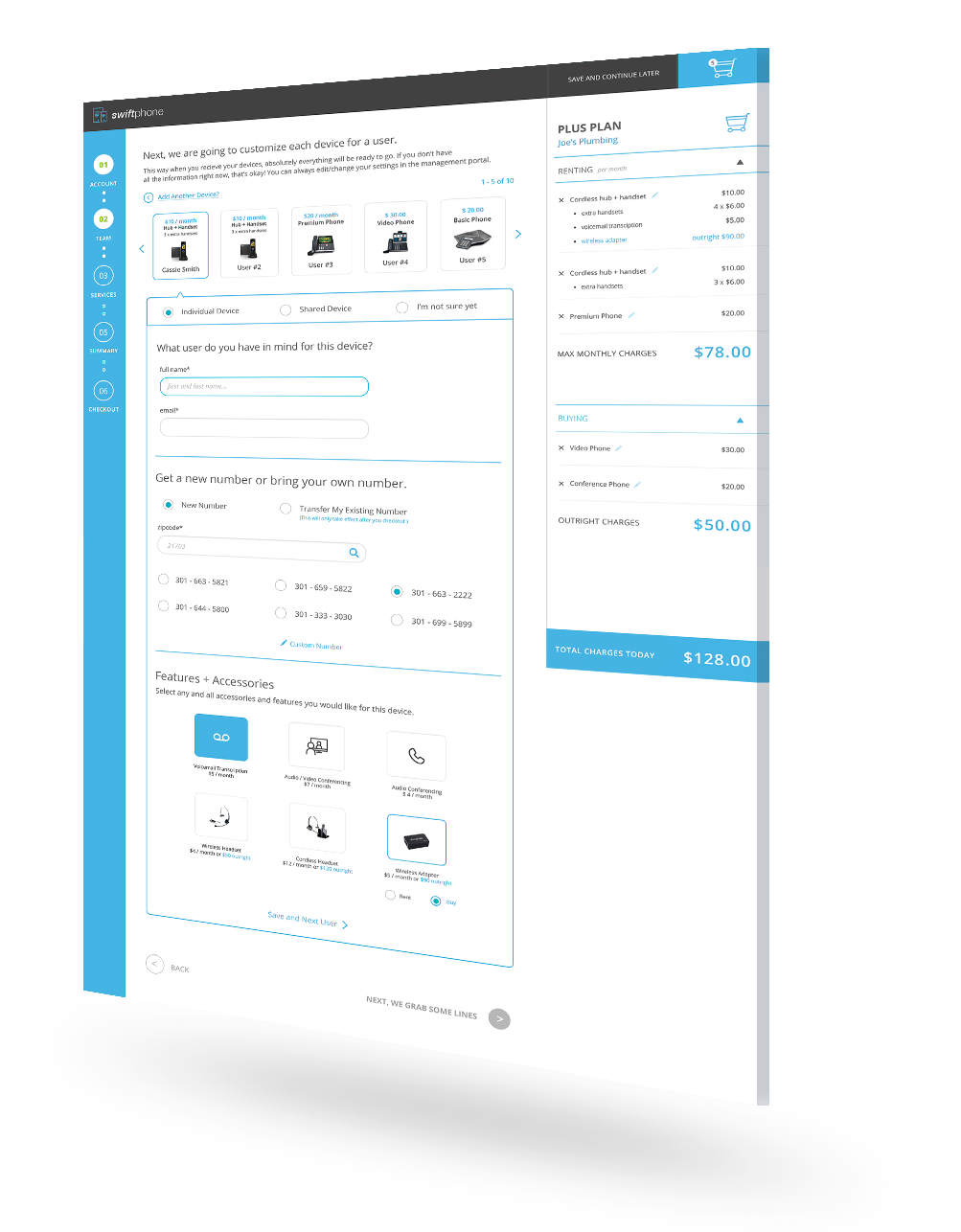
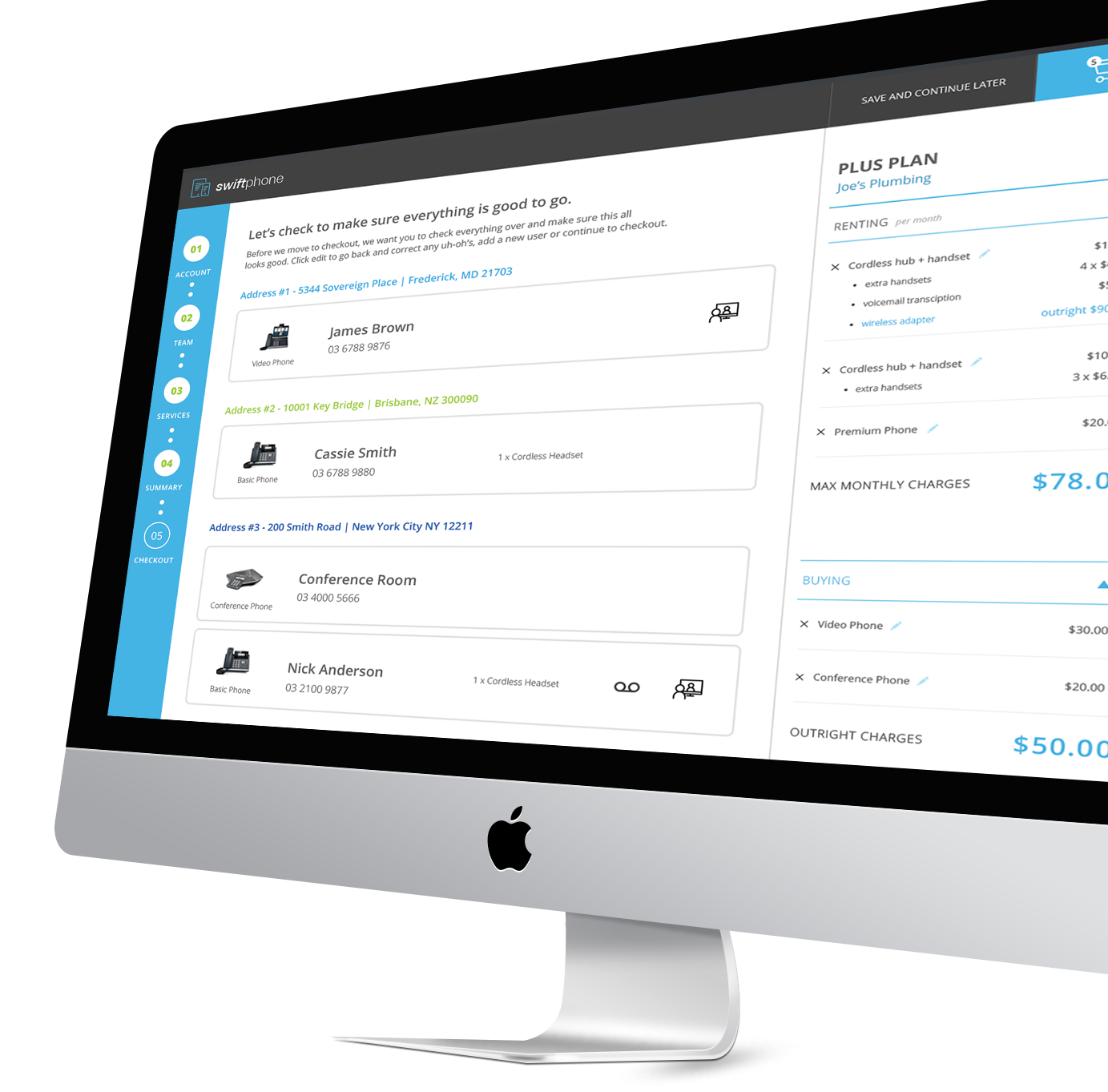
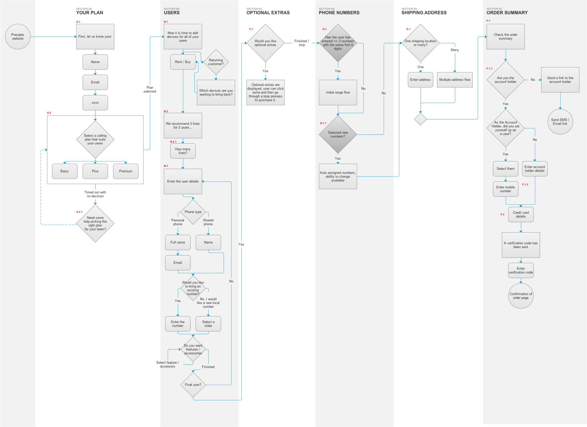
The existing system required buyers to navigate a maze of decisions with minimal guidance—selecting packages, choosing whether to buy, rent, or reuse devices, onboarding new users, porting existing numbers, assigning multiple shipping addresses, and ultimately checking out.
The challenge was clear:
How do we make a process this complex feel effortless and intuitive, without sacrificing flexibility or compliance?
We needed to design a multi-step purchasing experience that would support both individual buyers and organizations with layered approval structures, while minimizing confusion, cognitive load, and cart abandonment.
DISCOVERY
Through close collaboration with the client team, we conducted requirements-gathering workshops and journey-mapping sessions to deeply understand every touchpoint of the buying flow—from initial product selection to post-purchase confirmation.
We uncovered several key user pain points:
- Users lacked visibility into where they were in the process.
- Pricing, fees, and totals were unclear or inconsistently presented.
- The approval flow between buyers and procurement managers was confusing.
- The tone and language of the interface were overly technical, making it hard to follow.
These insights guided our UX strategy: create a guided, conversational journey that simplifies decisions and builds trust through transparency.
DESIGN
We transformed a complex enterprise purchase flow into a clear, step-by-step experience through intentional design choices:
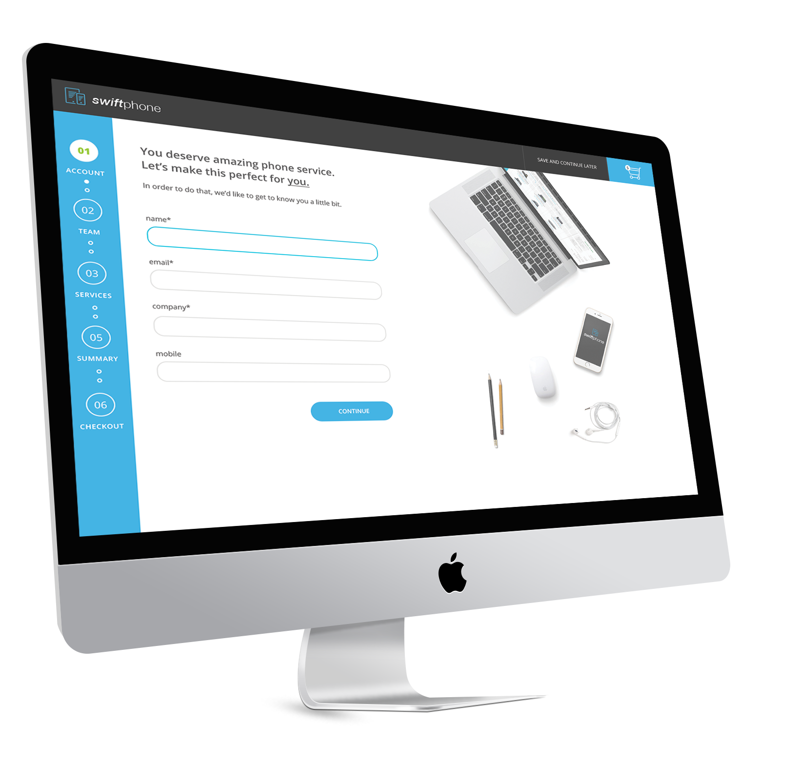
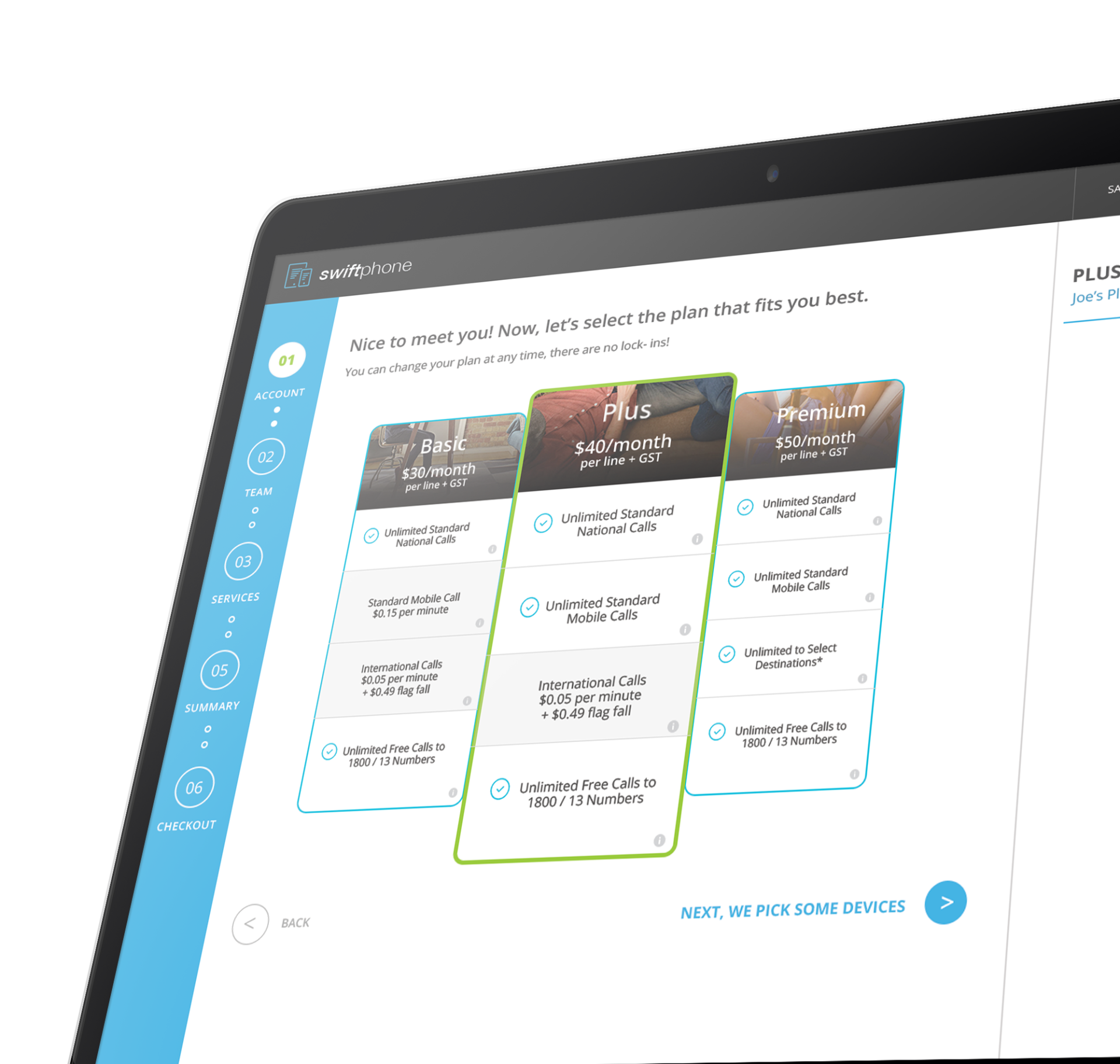
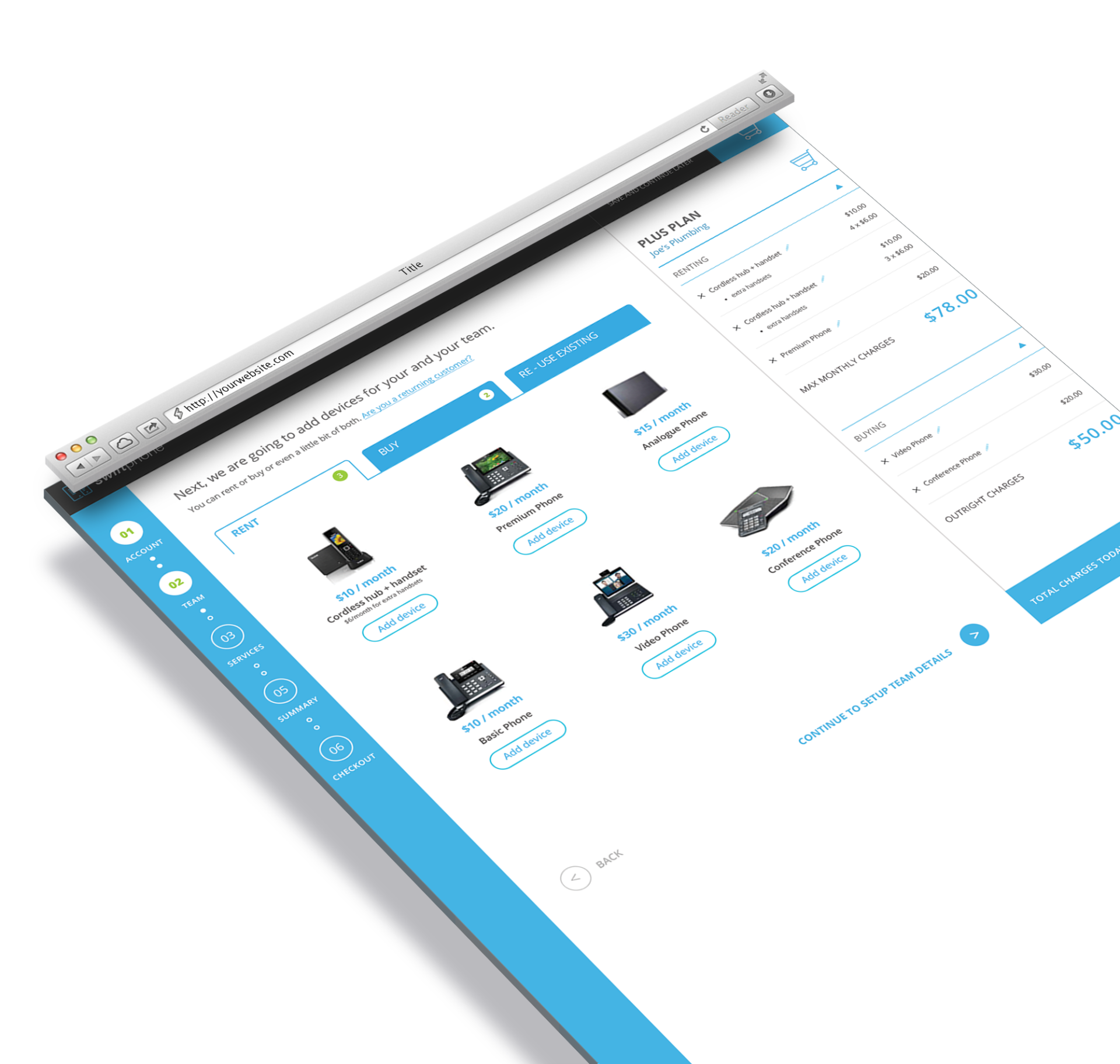
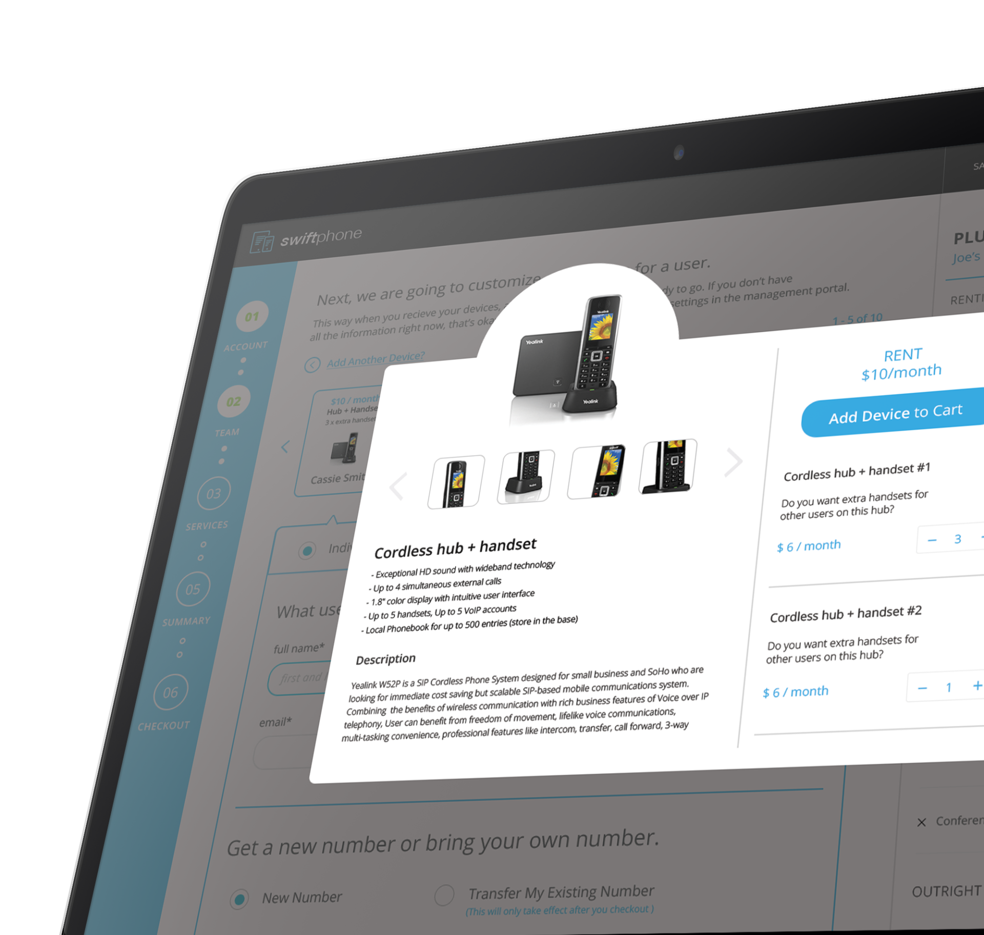
- Progress Tracker: Introduced a visual step tracker to help users understand their current position and remaining steps—reducing anxiety and drop-off.
- Conversational Microcopy: Replaced technical jargon with approachable, action-driven language to make complex decisions feel natural.
- Smart Task Segmentation: Broke large, multi-layered workflows into smaller, digestible actions to reduce cognitive load and support task completion.
- Transparent Cart Design: Designed a dynamic cart system that clearly displayed all associated costs—recurring, one-time, and optional—so users could make informed decisions in real time.
- Approval Flexibility: Built support for dual checkout paths—allowing users to either complete purchases themselves or route them to a manager or procurement officer for approval.
Impact
The redesigned portal dramatically simplified what was once a confusing, fragmented experience. Early usability testing showed:
- A significant reduction in flow abandonment.
- Improved user confidence and comprehension across both technical and non-technical users.
- Faster task completion and fewer support calls during the purchasing process.
By turning a complex B2B transaction into a guided, human-centered journey, the new design allowed organizations to purchase with clarity, confidence, and control—strengthening both customer satisfaction and business efficiency.
-
Date
March 26, 2017
-
Skills
Adobe Illustrator, Adobe Indesign, Axure, Invision
-
Client
mPortal