MyTWC Redesign
MyTWC Redesign
We worked with Charter Communications, Time Warner Cable and Bright House Networks which are now one company, now known by the name of Spectrum. My TWC® was a mobile app to manage your account and services, including review and pay your bill, get detailed billing information, check and troubleshoot equipment, manage your service/technician appointments and access Home Phone voicemail.
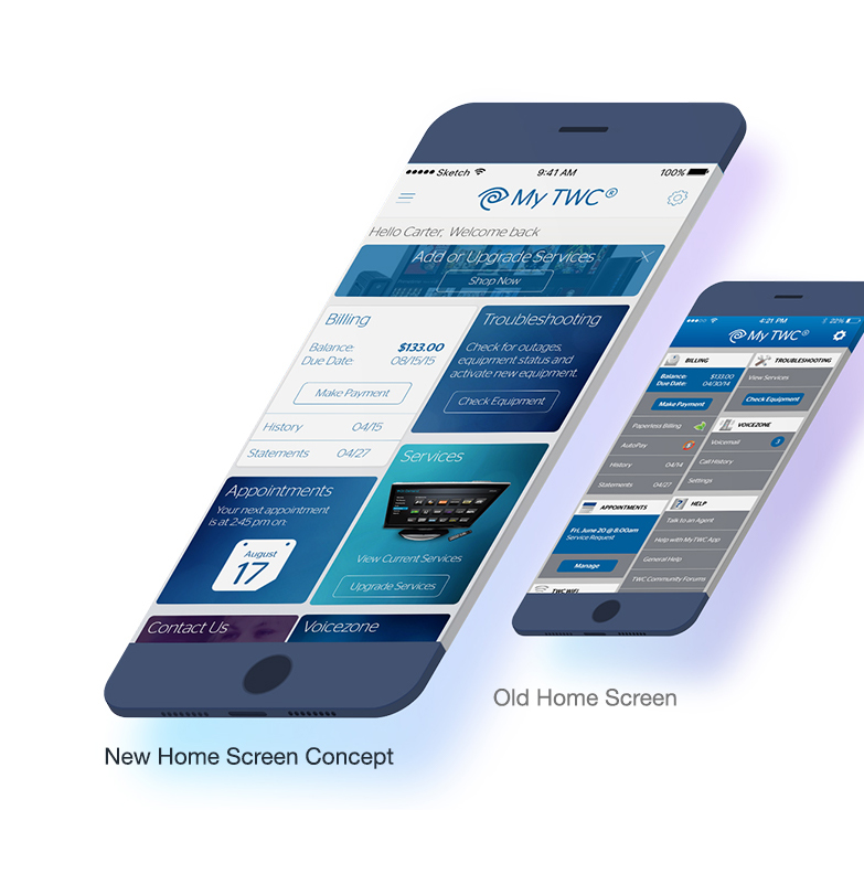
Redesigning MyTWC interface was a balance of stakeholder priorities and user centered design. The cards on the main screen represented a department within TWC and each department wanted easy access to their service. User testing and analytics were used to determine what functions should remain at the top, above the fold and which should have a lower hierarchy. The widgets that allowed more self-service – like billing, troubleshooting and appointment scheduling stayed towards the top to decrease customer care cost; a huge savings priority for most major service providers.
Billing was one of the biggest challenges. The billing widget on the home screen needed to communicate the balance and allow quick call to action to go in and pay that balance. We also displayed access to billing history and statements. Sounds easy enough?
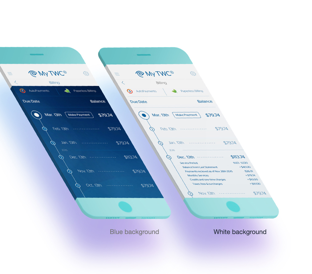
Well, the billing screen had a bit more challenge. The billing in TWC was rather complex as with most monthly subscription service providers. We had to communicate what was due – minimum payment and total, what was late, what had been subscribed to in a certain month outside of basic service, what one time payments had been made (like a extra remote), what credits had been awarded back to a customer, what taxes and surcharges had been aplied to that billing period and how to pay by using a credit card, debit card, checking account or savings account Billing flows were also built to setup recurring payments using AutoPay and set paperless billing preferences. Quite a bit of information.
Ideation was given to a sort of timeline design that would show monthly payments and would expand to show the details per that month. We designed a blue background version and a white background version, seeing if contrast would improve visibility or likability. User test results showed that people responded to the blue background with emotional dislike saying the blue screen was too “fun” for a billing screen. The white background seemed to read as more closely associated with important documents like paper receipts, invoices, legal documents, etc.
The end-to-end experience is a great buzzword but what it entails is creating an experience that can translate the ease of use and comfortability in form and function. That does not mean you keep the same paradigms throughout every platform, but it does stress that your users don’t feel like they are in a totally different experience.
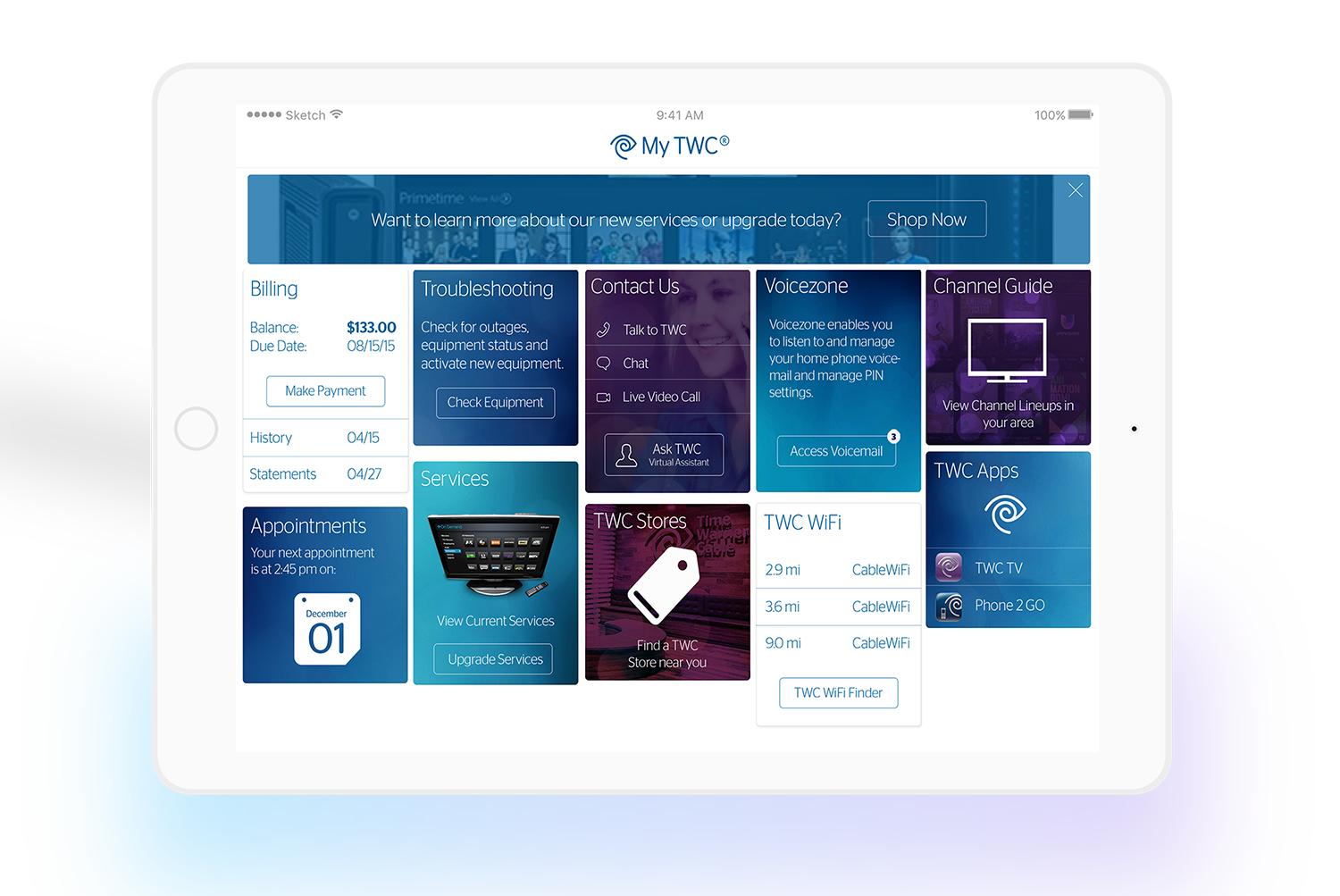
Here with the Apple watch and the Tablet screens, we kept the translation rather direct, by separating out the individual experience cards from the home screen, we created a swipe-able carousel that the user can navigate between function sand jump into detailed experiences. Likewise, the translation for tablet screens allowed more of the cards to have top hierarchy and not need the scroll that was needed on the phone screen.
My role: Lead Production Designer
My responsibilities: Meet with Client, Brainstorm modernizations, Design the re-envisioned interface, Record user testing to gain insight, work with client to iterate in agile production cycles
Task
Redesign the MyTWC app to create an end-to-end experience that translated ease of use and comfortability in form and function. We wanted to redesign, but also wanted to stress the importance that TWC users didn't feel like they are in a totally different experience.
-
Date
February 2, 2016
-
Skills
Adobe Photoshop, Adobe Ilustrator, Invision, User Testing
-
Client
Time Warner Cable