AT&T Collaborate
AT&T Collaborate
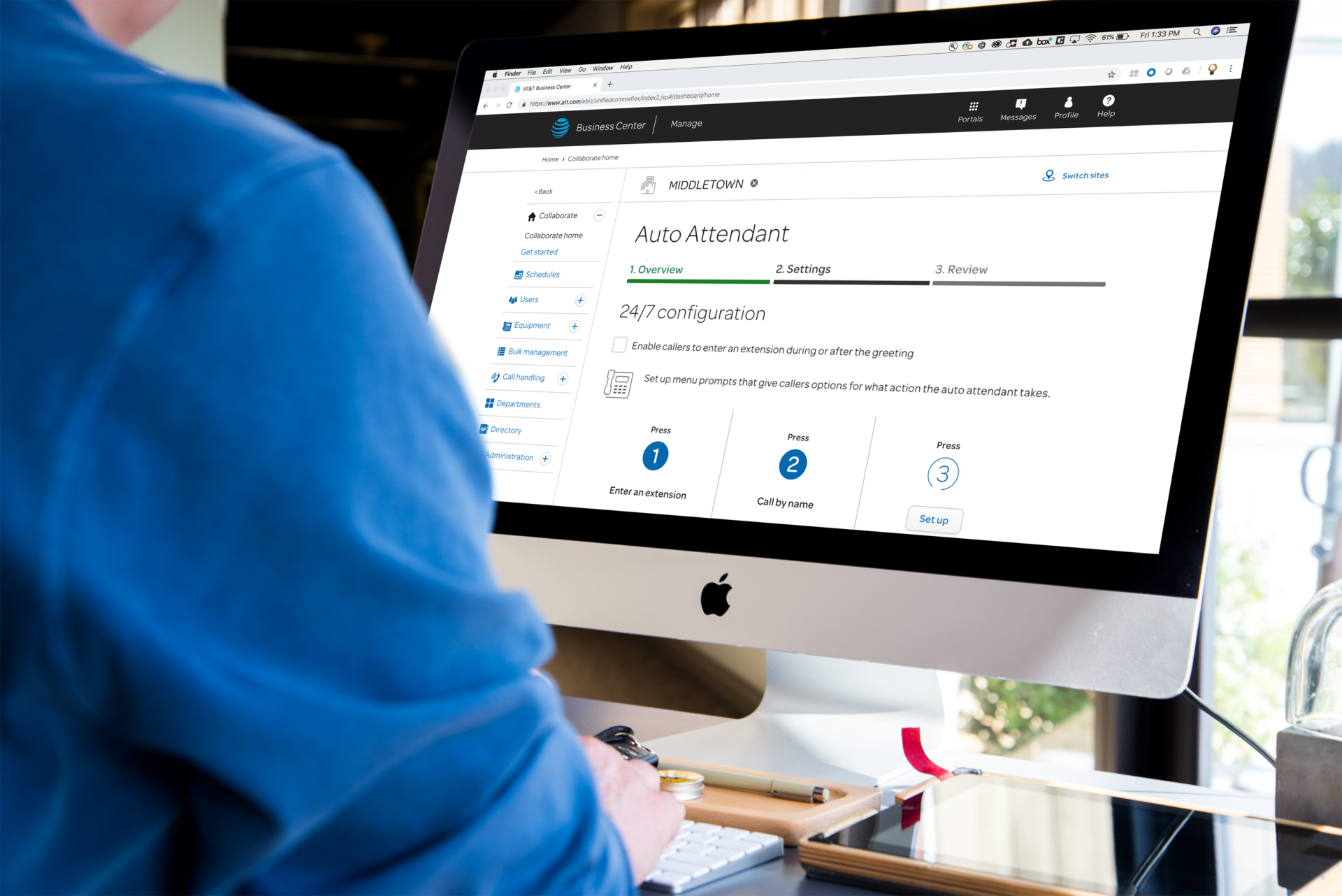
We’ve all experienced calling a business and hearing:
“Press 1 for English. Press 2 for Spanish. Press 3 to reach Customer Service…”
Behind these simple call flows are incredibly complex systems that allow organizations—large and small—to configure and manage automated call routing, voicemail menus, and support queues.
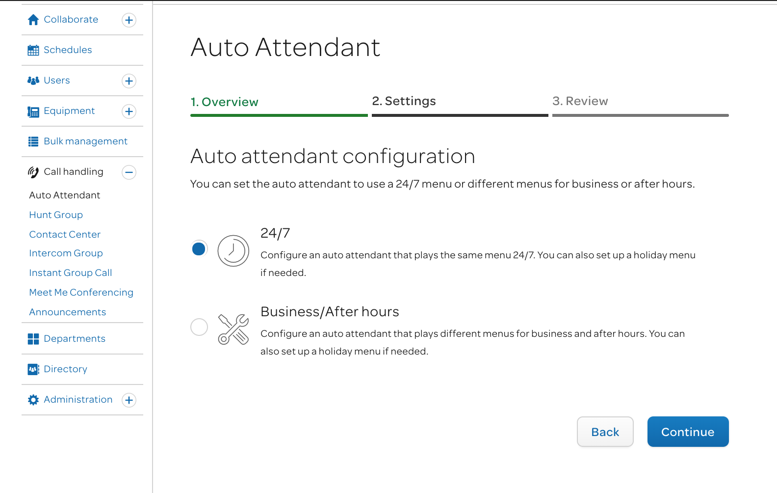
The AT&T Collaborate Portal is the platform that powers those experiences. However, before this redesign, the legacy system was nearly impossible for non-engineers to use. It was built with backend logic, cryptic configuration fields, and minimal guidance—making even routine setup tasks dependent on technical specialists.
OPPORTUNITY
AT&T needed to modernize an outdated, engineer-centric platform into an intuitive, web-based experience that any business administrator could use.
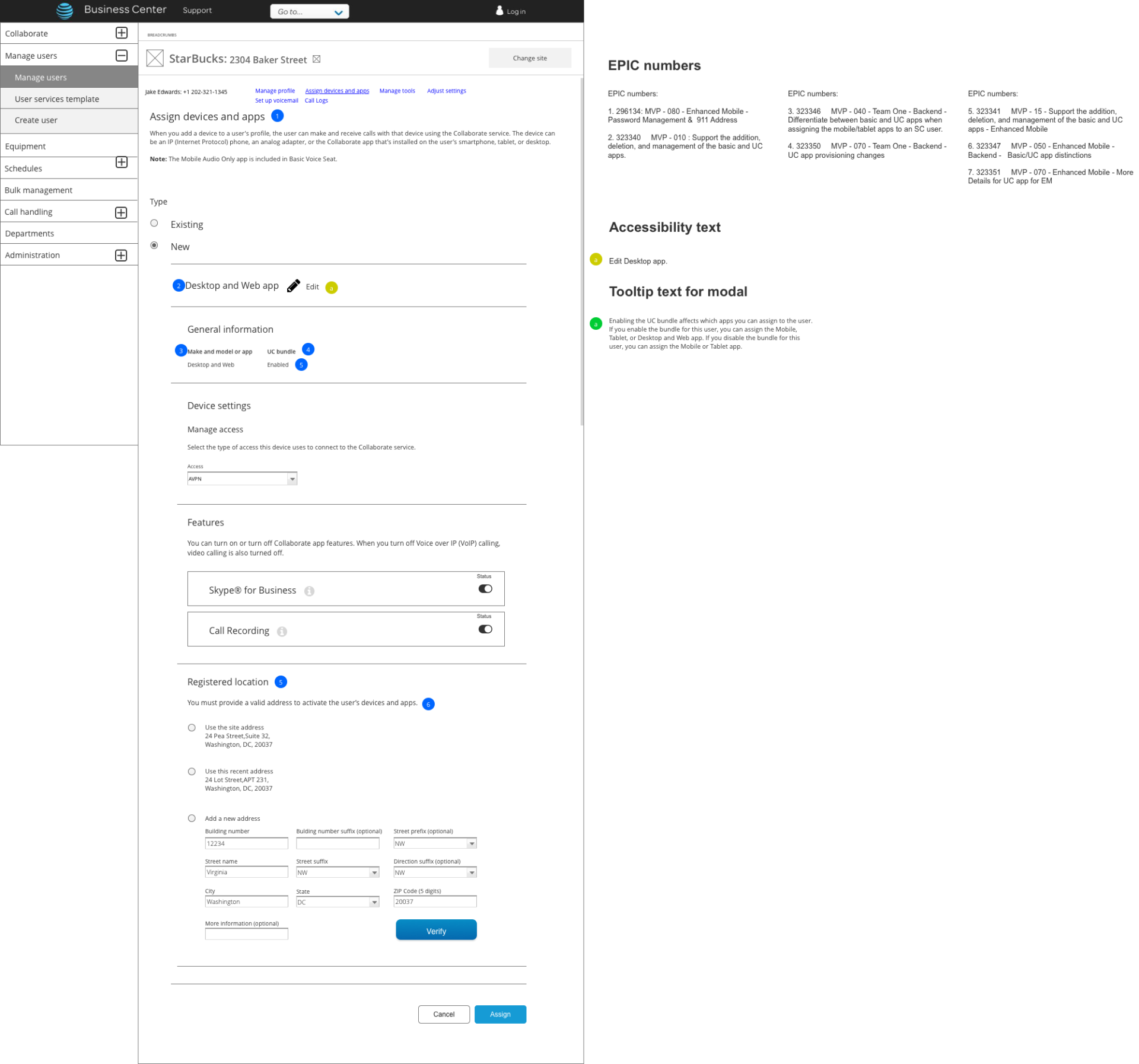
The existing system required advanced technical knowledge to configure features such as:
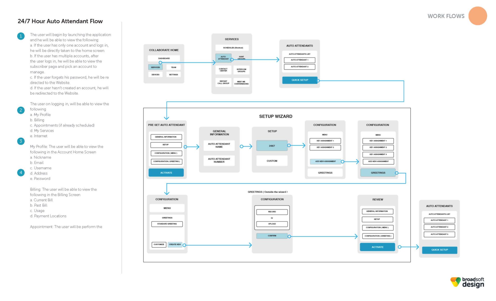
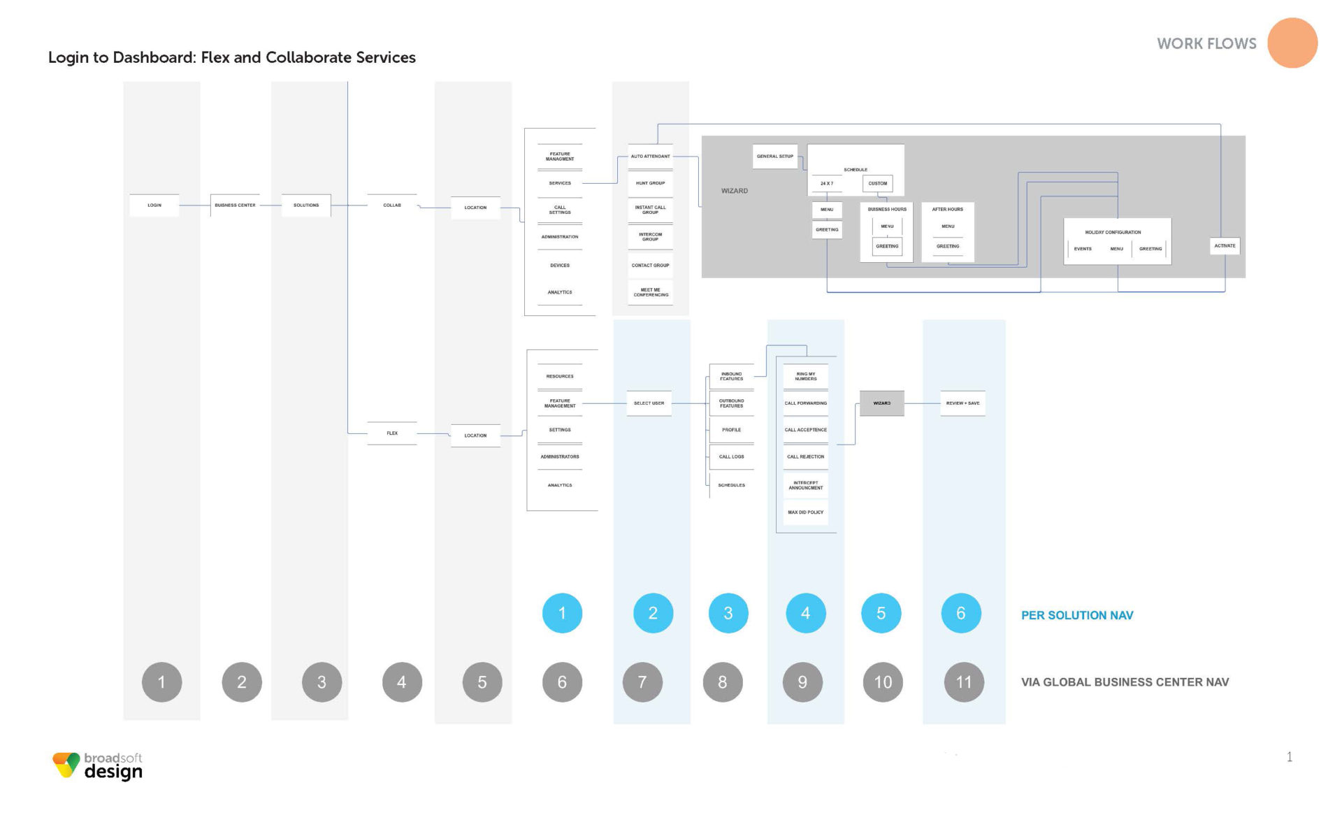
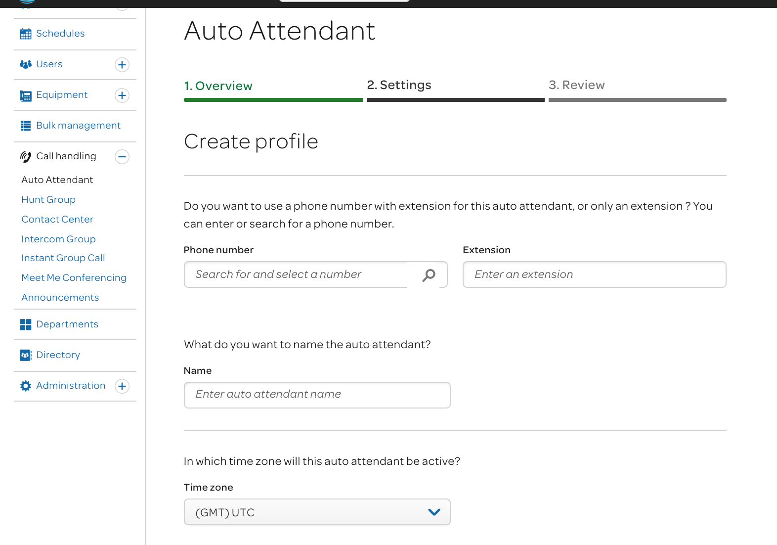
- Auto-attendants and call routing
- Voicemail menus and recorded prompts
- Extension and device management
My challenge as lead product designer was to transform this complex, code-driven interface into a human-centered, guided configuration tool—while maintaining flexibility for advanced admins and alignment with AT&T’s strict brand and accessibility standards.
DISCOVERY
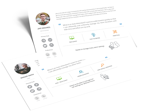
The redesign began with a comprehensive stakeholder discovery process. I partnered with teams across multiple AT&T departments—including product management, engineering, customer success, and design operations—to align on a shared vision for the platform.
We conducted requirement workshops (“lockdown sessions”) to capture both front-end and back-end user needs. This cross-functional collaboration clarified two distinct personas:
- Novice admins who needed simple guidance and visual assistance.
- Expert users who required fast access to advanced configuration options.
Research insights directly informed our information architecture, interaction patterns, and content strategy, ensuring both user types could succeed without friction.
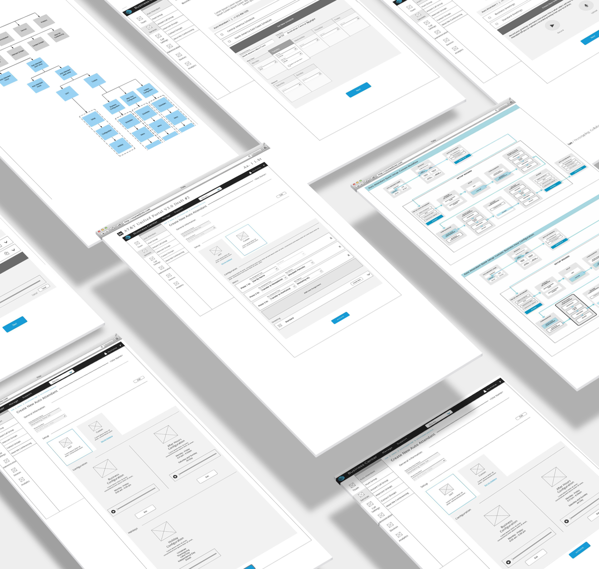
DESIGN
Our design strategy focused on clarity, accessibility, and confidence.
- Simplified language: Replaced engineering jargon with plain, action-oriented language that aligned with AT&T’s conversational tone.
- Visual explanations: Complex telephony concepts were reimagined as visual walkthroughs—illustrating call flows, menu hierarchies, and routing options.
- Guided setup flows: Step-by-step interfaces helped users configure auto-attendants and call services without prior technical knowledge.
- Consistent brand alignment: Partnered closely with BroadSoft Design and the AT&T Design Team to ensure all visuals, color systems, and typography adhered to brand standards while maintaining intuitive hierarchy and WCAG 2.1 accessibility.
- Dual-mode usability: Designed for both novice and expert modes—allowing power users to configure quickly while giving new users structured support.
IMPACT
The redesigned portal empowered AT&T customers to configure complex telecom services independently, significantly reducing support dependency and onboarding time.
The outcome was a flexible, accessible, and brand-consistent platform that balanced enterprise power with consumer-level simplicity—modernizing AT&T’s digital ecosystem and redefining how businesses manage their communication infrastructure.
-
Date
April 19, 2016
-
Skills
Adobe Photoshop, Axure, Invision, Zeplin, Accessibility Design
-
Client
AT&T
-
: